Hey @Arvind - thanks for reaching out and for your patience!
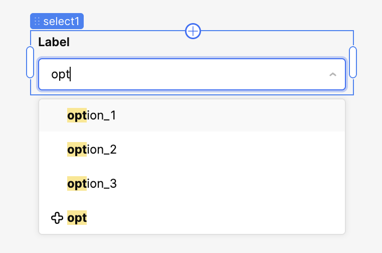
Currently, there's no native way to visually indicate that a particular option in the select dropdown is a custom option, which I agree would be a useful feature.
It's technically possible to engineer a workaround that augments the existing list of defined options with the current value of select.inputValue, but it's certainly not ideal. You can see an example of such an implementation here (76.1 KB). Hopefully something like that is sufficient, though!
@Darren Thank you for the update. However, it is important that we preserve the “+” symbol within the list. With some minor modifications, we were able to retain it, but unfortunately, the “+” symbol is then displayed as the input value or the selected option, which is not desirable. Your approach successfully prevents the symbol from appearing in the input or selected value, but the downside is that the “+” symbol disappears from the mapped list altogether in next iteration.
I am maintaining attribute custom:true on change event
Sorry for the delay, @Arvind. Along with the tweak you made, the workaround that I described previously is likely as close as we can get based on the constraints of the existing component. If I understand correctly, the last thing you're trying to do is to display the selected and listed values differently?
If you or somebody on your team has a technical background, creating a custom component with the precise behavior that you're looking for is probably the quickest solution!
Hey @Arvind - just wanted to let you know that I submitted a formal feature request to support distinct labeling in the options dropdown. I'll let you know when I have an update.