A couple users asked me how they can have more horizontal space for their big-screen retool apps.
While we don’t officially support it, you can make retool full-width with a few lines of CSS (you can put CSS in a text component):
<style> .retool-canvas { max-width: none !important; } </style>
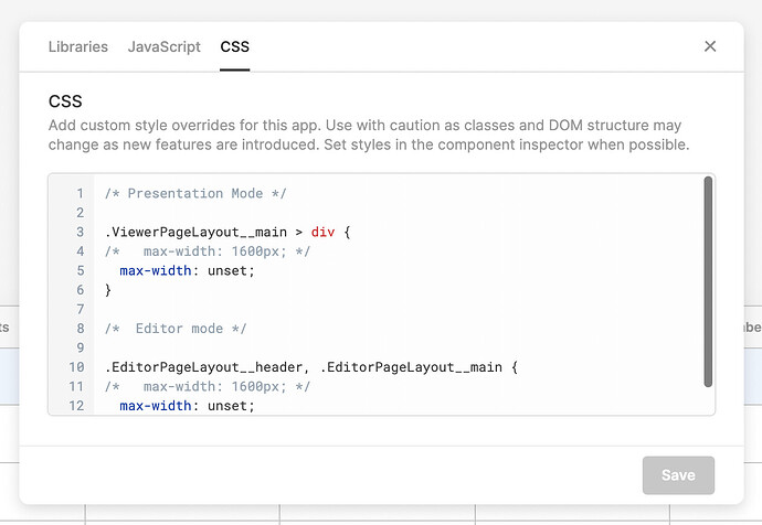
Updated CSS for the newer version of Retool with the header layout below. You can also uncomment the max-width lines to enforce a narrower maximum width than the full browser width of your users' devices.
/* Presentation Mode */

.ViewerPageLayout__main > div {
/*   max-width: 1600px; */
  max-width: unset;
}

/*  Editor mode */

.EditorPageLayout__header, .EditorPageLayout__main {
/*   max-width: 1600px; */
  max-width: unset;
}
You can add this CSS locally to individual apps from the Scripts and Styles setting from the ... menu in the app editor or globally to all Retool apps from the Advanced Settings page.
Update!
Since our CSS classes change often, I believe --retool-canvas-max-width: 10000px; (or any reasonably high number) should do the trick for now! Use with caution since again, our class names can change at any time, though we'll eventually add a setting for this in the UI ![]()
:root { --retool-canvas-max-width: 10000px; }Newest update!
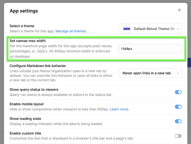
We've added a setting in Retool to allow you to configure your app's max width. You can click the three dots in the top right corner > App settings > Set canvas max width

Let me know if you have any questions about this setting!
I've tried setting this to a lower value, but it seems to only affect the editor and the viewer link – not the public link.
Seems related to this bug:
Thank you for reporting this @jpfaraco, and thank you being everywhere all at once, @bradlymathews!
Just to update this thread as well, the fix for this will be shipped to Cloud next week in Retool v2.111.0.
Let me know if you still see this bug once that version lands!
Hello Victoria, I am running an on premise instance of retool using version 2.108.3 and can confirm the issue of full width in Public mode. However I don't find it to be an an issue and would like to implement this on other apps as I like that it utilizes the entire screen real estate. Is there any CSS I can inject to replicate this permanently?
Hey @MacD87!
I was able to get this to work with the following CSS:
._tEOXQ, ._1edro {
  min-width: -webkit-fill-available !important;
}

#root > div.no-expiry-header > div > div > div > div > div > div.embedded-canvas.retool-canvas.retool-canvas--app-shell.embedded-canvas--with-pill.no-mobile-layout > div > div {
  min-width: -webkit-fill-available !important;
}
Note that this is specific to my app and your selectors might be different than mine. I've attached a screen recording showing the two selectors I grabbed to make this possible.
You may also be able to use a more general selector, but this is what I've gotten to work so far! Let me know if you have any questions at all.

Thank you! I see how you found the selector specific to your app. That will be helpful for future reference on a case by case basis.


