I have a multiselect component that populates its options from a query, and it also allows custom values to be input.
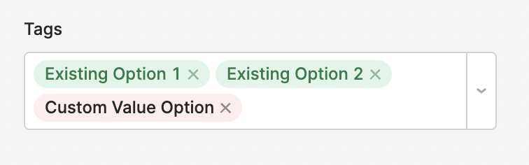
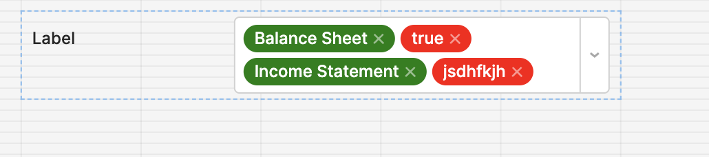
What I'd like to do is color all the options that are already in the database the same default color (in this example green), and then I'd like to color custom value options that have added a different color (in this example red). I'd like to do this so that the end user has an indication that they're about to add something new to the database.
@ScottR, hmm, everything in that post seems to deal with the Tag Dropdown column type in a table. However, I'm dealing with a multiselect component, so I don't understand how anything in that post is relevant to the issue I have.
@benbarry I assumed you would have understood that a ternary operator could be used. I assumed incorrectly, so my apologies.
The logic still applies though, does it not? - Why can't you use a ternary operator to determine what already exists and set that to green and if it is new then set the color to red?
@ScottR I'm just not sure where you're proposing that I use a ternary operator.
Using it in the mapped options would be pointless, since every option there is already in the database.
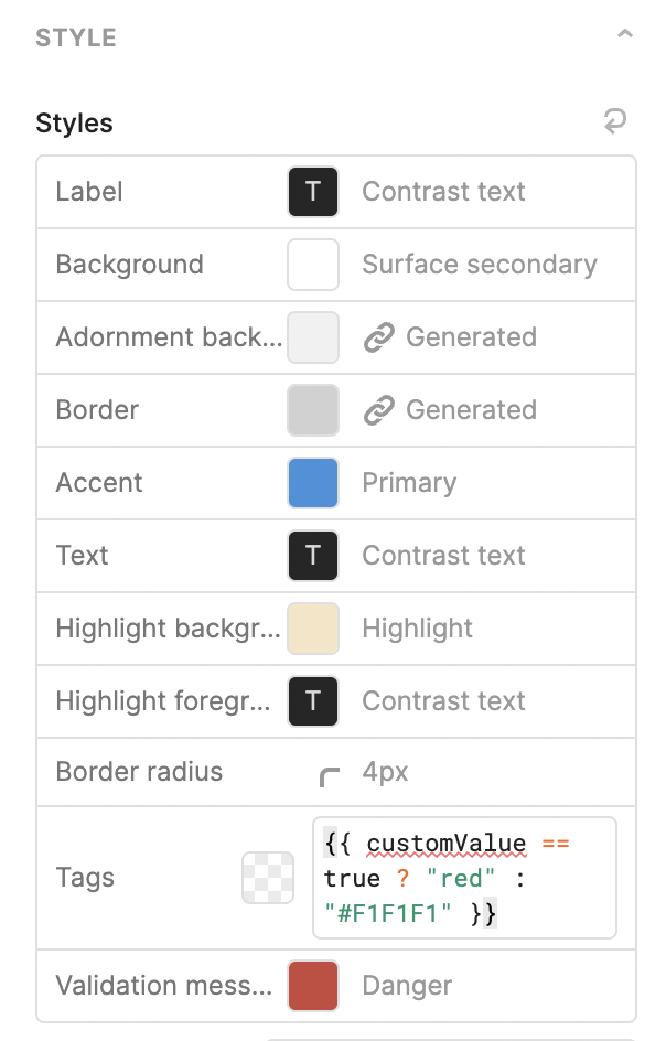
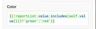
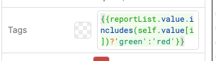
And, it doesn't seem that I can use a ternary in the Styles section to set the tag color for each item. It seems like the Style just sets a default globally for that component, and something like item or i is not available to be used.
Like, I totally understand that I could use a ternary in a situation like this. In this particular database there is a type field, and I could color each tag based on that type in the mapped options.
@ScottR I had tried something similar to this yesterday. It seems like maybe you're getting a different behavior than I am though, and I don't understand why (feel like maybe I'm missing something obvious).
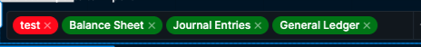
I recorded a quick screencast of the behavior I'm getting:
Hmmm you know what even if I remove the ! in it and say if true then green if not red I am now running into the same issue as you... Could be a bug I just find it odd that it worked a few minutes ago and now it isn't.... I'll keep pecking away and see where I get...
@ScottR, so this is functionally the same as the "solution" I had in my original post, and still not quite the behavior I desire. That original "solution" achieved this same result in a simpler way.
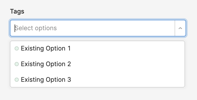
The issue here is that by adding color in the mapped options, it applies the little color dots in the dropdown list. Since they're all the same in this case, they don't provide any real utility and are just a visual distraction.
Yes, that CSS does hide the circles! I have always avoided styling things based on those kinds of classes, since I assumed they were auto-generated and might not be stable. I think this will be sufficient for my use case.
I thought you might run in to issues if you had a multiselect where they did want the circles and another one where you didn't on the same page, but it looks like specifying the multiselect ID works for that case.
You're right there @benbarry, those classes aren't guaranteed between versions, they should just be stable enough to use as a temporary workaround. I think the longer-term solution here is for you to have the option to hide the color circles which I'll bring up with the dev team.


 also very interesting to see the steps yall have taken so far.
 which I'll bring up with the dev team.