Hi,
We are embedding a public Retool app as iFrame into our website(wow.voosh.in). But the problem is when we open in mobile phone, the link was not changing into mobile view, Can you please help me out here
Thanks,
Chandu
Hi,
We are embedding a public Retool app as iFrame into our website(wow.voosh.in). But the problem is when we open in mobile phone, the link was not changing into mobile view, Can you please help me out here
Thanks,
Chandu
Hi @Chandu! Thanks for reaching out about this
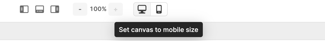
Just to confirm, by mobile view, do you mean the mobile setup that you have created for the app in the editor?
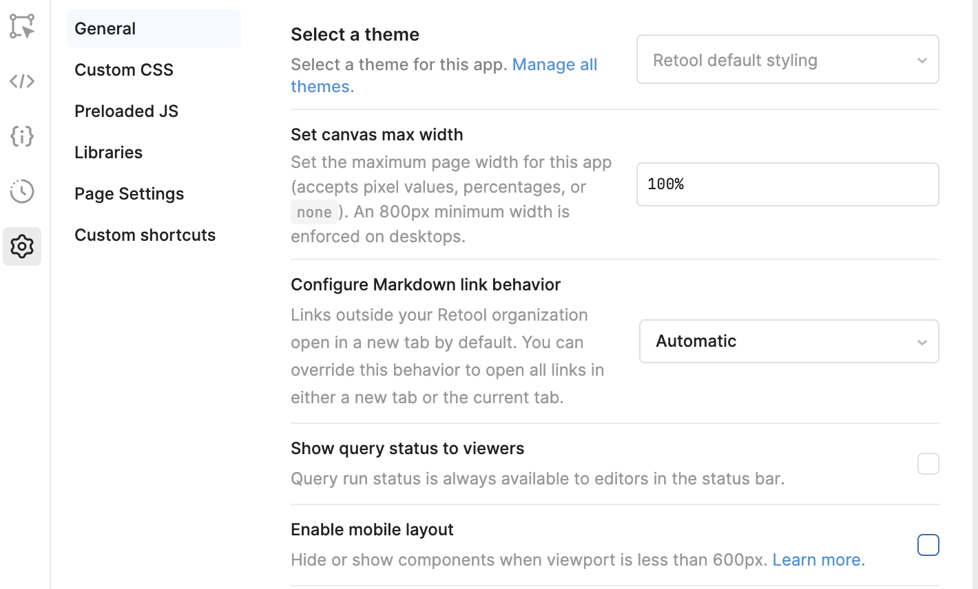
The mobile layout should be automatically triggered when the width of a user's viewport is 600 pixels or less  . There is an advanced setting for allowing this automatic switch to the mobile view; it's on by default, but maybe it was checked off for your app?
You can check under App settings:
What device/browser are you using?
Hi @Tess;
To have a mobile layout, you have to develop it on the mobile setup!
Are there any more efficient ways to do it quickly, instead of developing them separately, if I want to develop both, web and mobile? 
It isn't very pleasant to do the development twice, for the same views. I like Retool a lot, but for the moment, this point blocks me, because often I have to do both apps. !!! 
Hi @Nocia87 Thanks for this feedback! I'm sorry to hear it's blocking at the moment 
We are tracking a few feature requests internally for responsive design based on screen size and for a global toggle to enable all components with "Show on mobile" I'll post here with any updates that I get internally!