Increased configurability for Wizard component

We recently discovered the Wizard component and found a few great use-cases for it. However, we've noticed a lack of customization, mostly around the UI/layout a little frustrating.

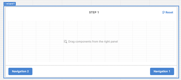
It'd be great if we could customize the look/layout of buttons generated by the wizard to navigate to other steps. Currently, the buttons appear on the sides of the wizard component in the primary colour only.
2 Likes

Hey @ericpickup, thanks for the feedback here! We can pass it along in this thread if we make changes to the options you have to style the wizard component. In the meantime, have you tried using the stepped container? It doesn't have the full functionality of the wizard but comes with more styling options and fully customizable buttons.