Hey team, I want to report some discrepancies between what I see in the mobile development environment, and what I see on my phone when opening the same app:
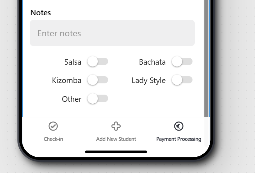
Development interface:
IRL mobile app:
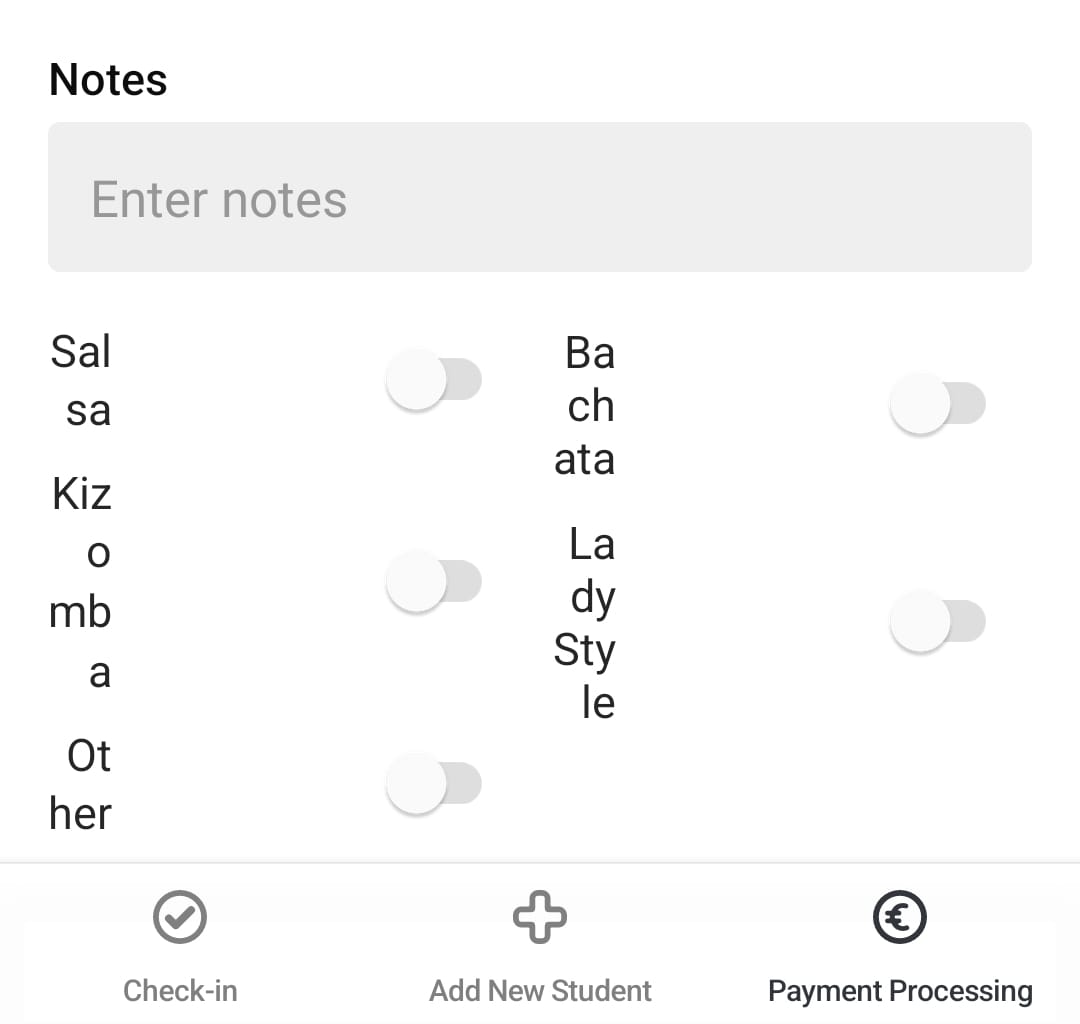
I am using a Samsung Galaxy S10e, but other users of my team have also reported to me that they see similar messes on their variety of phones (android and iOS)
This array layout is built as follows:
Horizontal container (fill, justify left){
|    2x Vertical container (fill, justify right){
|    |    3/2x Horizontal container (fill, justify left){
|    |    |    text (fill, justify right)
|    |    |    switch (no label)
|    |    }
|    }
}
The deeper level horizontal container with text was because I also had display discrepancies when trying to use a label part of the Switch component --> that's already an issue
Playing around with containers, deleting/recreating components etc, sometimes fixes it but causes a different mess on a different phone etc, but obviously that's not a clean way to fix the problem.
I don't know if the issue is because of the big container tree that I'm making (maybe there's a better way of getting the same layout outcome), or because of something more systemic, but clearly the outcome is very different between the dev environment and the actual app.
I hope this helps and will be happy to share more if you need me to.