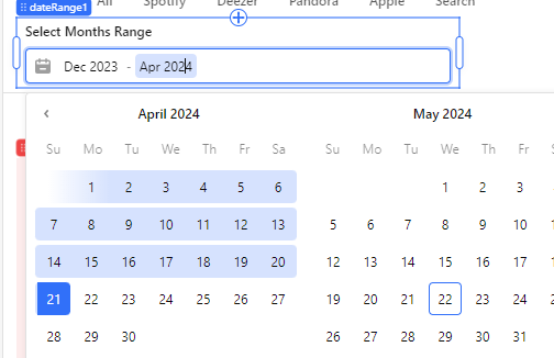
The "Date Range" component could be improved. i.e. This thing could start as early as 1970 and the only way the year can be advanced (without code) is by scrolling through the calendar which could take hours.
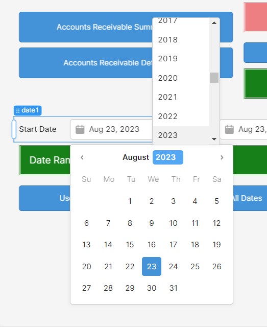
The "Date" component has a feature whereby you can click on the Year and change it, which solves this problem.
So I have used a Start Calendar and an End Calendar which works fine but I think this should be added to the "To Do" list for our component developers.
I am including a screen capture of the Date component.
I agree @mdsmith1 the range component lacks the ability to quickly change the year or month by large increments. And yet it otherwise looks almost identical to the date picker component.
I think for the purposes of standardising (and improving) the UI component library, the dev team should consider this.
I think a number of the components need a second look.
The button, text, text input, number input and others have no style options for font size. We have colors, borders and rounded corners but no control of font size.
The properties available on components are so arbitrary and frustrating. I can't even change the font look on a link component, let alone use markdown with it.
Retool: you can change these things in CSS
Me: Why should I have to? I could do this with Delphi 20 years ago.
Thanks everyone for the feedback! I've shared this internally as well! Hopefully, we can ship font size controls (among some of our other styling updates) as well as a date range upgrade
Any ETA on the date range changes ? Being able to scroll by month only makes the component pretty useless considering the alternative (2 date components)
I added the Date Range component to my app and since the use case is to select a date range between two months irrespective of day, I set the format to MM-yyyy, however this only affects how the text representation of the date is displayed, it does not affect the UI so the user is shown a calendar from which he selects a date. This is confusing as the use case expects a Month only
I feel the frustration, been there as well. I ended up using the default "month" component which is basically a select with the months already provided by default. It is not ideal but it is a good workaround....
 as well as a date range upgrade
 I'll let the team know you checked in!