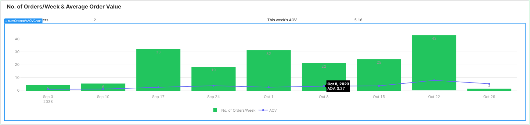
I have a chart in which I want to display 2 different data series:
- No. of Orders / Week
- Average Order Value (for that week)
I already have the queries for both data sources. The first returns the total no. of orders in every week from Sunday - Saturday, including the no. of orders and the total order value/revenue.
The second returns the average order value also for every week from Sun-Sat where AOV is calculated for a given week by total revenue for the week / total orders.
My problem
I've read the official Retool docs on adding a 2nd Y Axis as well as this forum post (https://community.retool.com/t/charts-with-multiple-data-sources/18816), but I can't figure out how to do the following:
- Where in the Plotly.js snippet do I add the second Y Axis for Average Order Value. and how do I format it so it has a different scale (i.e. a larger scale so it's not so short compared to the bar chart)?
- How do I change the font color of data labels (currently, they default to a light grey, which doesn't work well when it overlaps with my bar colors).
- I figured out how to add the second data series, but I can't figure out how to plot it against a second Y axis!
- How do I add data labels to the second data series, i.e. in my case, the scatter plot?
Thanks,
Zhifeng