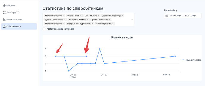
I think a bug might have recently been introduced with handling zero values for X and Y data on plots. The easiest way to recreate the bug is just do an X and/or Y series like [0,0,0,0] . In my case, I have data that is grouped across 20 different values, and 1 of the groups happens to have all 0's for its respective Y series data. The chart breaks in that case, with the same error you would get with the above 0's array.
Thanks for reporting this, @drewski. We are aware of the bug and are working on a fix. I'll let you know when the fix is live on cloud!
I'll update with additional feedback, suggestions, bugs as I find them...
- Color Selection (for Pie Chart, haven't tested with others)
a. I like the 'as an array' where you can be very specific
b. Would be good to also include the 'theme.automatic' option that cycles through colors already specified in the app theme  Text on Chart
a. Differentiate style between label/value/% (e.g. label as 12pt bold, and a % below it in 10pt normal)
UPDATE: Now it has a dynamic [fx] button so you can add <span> tags to style as desired!
- Legend Sorting/Order
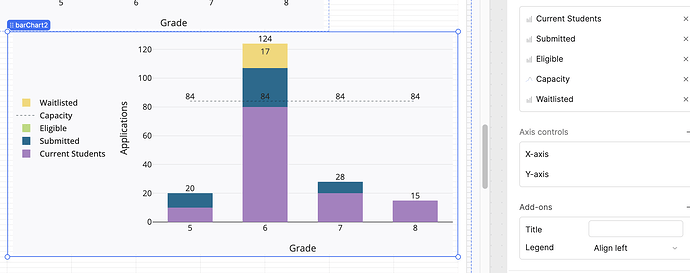
a. The data being used is in a specific order, but the legend and pie wedges seem to default to "slice size: desc" -- would be good to be able to choose alphabetical, numerical, asc/desc, manual order, etc. I'm showing grades that end up being "4th grade, 7th grade, 5th grade, 1st grade" -- which is a strange order to see in the legend.
UPDATE - another example. Here you can see that the series order is the reverse of how they show up in the legend... so each added series gets put to the top of the legend. Ideally, it would mirror the same series order seen on the right -- and on the right you could drag them to move in whatever order you want (or choose asc, desc, etc.)
-
Legend Positioning
a. Being able to control like margin/spacing as a % or in pixels -- some of mine are leaving a big gap between the chart and legend and I'd rather the graph itself be much larger without the legend taking up 50%. -
Additional Mixed Option
a. I was trying to do a mixed with bar + stacked bar -- I'd either like a normal bar chart next to a stacked bar or the ability to choose stacked/overlay/grouped on a per-series basis. The idea is to show progress. So imagine a 0-100 bar, and then next to it, the stacked series of 0-10, 11-20, 21-30, etc. Or having those 0-10,11-20,21-30 as a stacked bar as an overlay over the 0-100 in the bg. Something like a progress bar, but with the filled part of the progress as a stacked bar chart. -
Download as PNG
a. Ability to name file (similar to when using the export functions)
b. Higher quality image -- you can't specify the size or resolution at all, so they are really small and basically useless. Actually, a "view full screen" in the toolbar would be great.
More to come as I keep creating - but so far the experience has been positive and easier to use than the plotly charts.
Hey Darren,
It seems that the 3.105 has been released, but I don't see any notes related to new Chart component. Do you know if it has it been postponed?
Thank's a lot!
Would really appreciate being able to resort the items in a stacked bar chart/legend manually!
Hey Francis! I think it is missing only one key part that Ploty charts allow, which is selecting the tick interval, not only the format. It is key to show monthly data, so you can choose to show only one tick per month instead of what currently happens that it adds new ticks in the middle, with the same month repeatedly.
I can't seem to get the new charts to show up on self hosted. I can see them on my cloud version of the same acc.
@Darren @francis12 it seems no Chart component has been released in latest Edge version (Self-hosted Retool 3.111 Edge release notes | Retool Docs). Do you know how we could access this seemingly great new feature? ![]()
Hi @Dug and @Laurin_Boujon1! For self-hosted instances running version 3.105 or newer, access to this feature requires that the corresponding feature flag be enabled for your particular organization. I can quickly take care of this if you want to DM me your org name!
A post was split to a new topic: Using new HeatMap chart and want to set values range independent of passed in data
Hi,
The new chart component was a missing piece in Retool – thank you so much for adding it!
For the mixed chart, it would be great to have the ability to hide series using JavaScript.
Regards,

