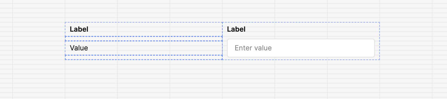
I am building to states for my app, one is an edit active state and the other an inactive state. I know I can just set a text input as read only but that doesn't look good, which is why I am building the components like this:
The left one gets displayed when the edit status is inactive, it looks nice. The right one gets displayed when the edit status is active.
However as you can see since I have to build the left component out of many parts I think it would be nice to have that as a build-in component so that the total height matches the height of the regular input component.
What comes near this is the editable text component, but that one has a different height:
Thanks for reaching out to us. I'll start a report on this! Especially the differing height between the editable text component and text input component.
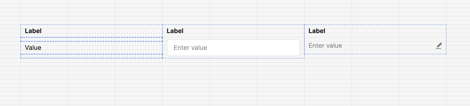
How was the combination on the left made?
Would using a ternary to set the opacity of the border and background such as {{textInput2.readOnly ? "rgba(255, 255, 255, 0)" : "white"}} work here?
the combination on the left is just text, spacer, text, spacer. I think a good solution would be to modify the editable text component so that it matches the height from the text input component.
Your suggestion would work but then there is an indent. As I said this is just a minor point, it's not that important but would improve overall aesthetics.