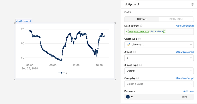
Hello everyone. I will apologize ahead of time for my extreme noobness but I am trying to figure out how to make simple temperate line graph based on a REST api query. The query I have setup is returning a dataset that looks like the following below. How can graph only the returned values "t" and "v" from the the query.data.data below and get this to graph?
This is the query:
https://api.tidesandcurrents.noaa.gov/api/prod/datagetter?date=today&station=9410230&product=water_temperature&units=english&time_zone=gmt&application=ports_screen&format=json
And the returned data:
 {
      "metadata": {
    "id": "9410230",
    "name": "La Jolla",
    "lat": "32.8669",
    "lon": "-117.2571"
      },
      "data": [
    {
      "t": "2020-09-24 17:00",
      "v": "69.4",
      "f": "0,0,0"
    },
    {
      "t": "2020-09-24 17:06",
      "v": "69.4",
      "f": "0,0,0"
    },
    {
      "t": "2020-09-24 17:12",
      "v": "69.3",
      "f": "0,0,0"
    },
    {
      "t": "2020-09-24 17:18",
      "v": "69.3",
      "f": "0,0,0"
    },
    {
      "t": "2020-09-24 17:24",
      "v": "69.3",
      "f": "0,0,0"
    }
    }
      ]
     }
