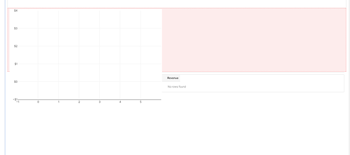
Anyone else experiencing a strange initial loading of the new chart components? The chart overlaps other components on the left side [edit, actually the image on the left side is fixed in place, so if you expand the vertical height of the chart, the image of the empty chart will look the same]. This happens on initial load, and remains like that if no data is loaded.
Hello @drewski,
Thank you for sharing this, I haven't seen this before. But I would love to get to the bottom of what might be causing this.
Just have a couple questions to try to reproduce this.
-Is the empty chart on the left a Bar Chart(v2)? Is the new component you are adding a Bar Chart of a different version of the v2 charts?
-You mentioned this component on the left is fixed in place, how did you fix it in place?
It looks like the new component with the red coloration is expanding to fit the entire width of the app canvas which shouldn't be happening on initial drag and drop (unless you specified for this size).
As well as that it is pushing the existing empty chart on the left up higher on the Z index and situating itself underneath, which is not expected as it should either move itself above or below the other component ![]() very odd.
very odd.
Hi @Jack_T,
The chart is a line chart v2. The grid you see on the left and the red outline on the right are the same chart. When the chart initially loads, it looks like this, and then when data is available, the grid on the left morphs into the chart and the chart renders as expected.
I have some charts that don't have grid lines turned on, and they don't seem to have the same problem (I think they do have the problem, the lines just aren't visible because they are turned off).
It looks like both the grid lines and the axis lines will render like you see on the left, and then when the data loads, they snap to the correct size of the chart, so there is a couple seconds on loading where the chart looks like this before the data loads.
Ahhh ok I see, thank you so much for the clarification!
One work around for this would be to hide the graph until the data source has been fetched by a query. This would involve storing the source data in a "middle man" JS variable, setting the table to be hidden while this variable is empty and then it will appear just in time once the query runs and populates the variable(and thus the table).
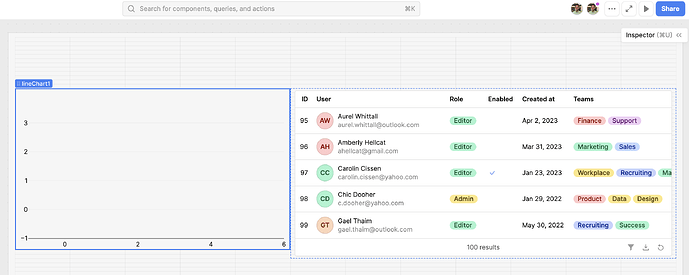
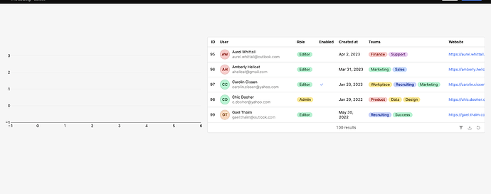
I was looking to reproduce this, but even with a line chart v2 with no data source, the empty chart appears and does not overlap with any other components. Are there any steps that I am missing on how to reproduce this bug? Is your screen shot from edit mode or live app?
Editor:
Live app:
Hey @Jack_T ,
The loading bounce is a vertical bounce, not a horizontal one. That is, the overlap is on a component below the chart. When I do the hidden trick, it works mostly, but there is still a noticeable bounce when the chart loads - where it loads bigger on the left, briefly overlapping the table below, and then snaps to the correct size.
I am not sure how to not reproduce this, it happens on every chart I use. Have you tried using a chart with a data source connected to it to trigger the delay in loading?
Hi @drewski,
Let me know if this video works for you, I tested out having a line chart load in data from a query, while directly above a table component in both editor and live app mode and didn't notice a lag or change.
If you could share a loom video of the query and the behavior on page load/refresh that would be helpful for trying to reproduce what you are seeing.


