I worked out how to do this using a Custom Component and d3.js, example below (my data being a series of weekEnding with metrics numberOfVisits, searches and uniqueContentNames):
<script src="https://unpkg.com/react@18/umd/react.development.js"></script>
<script src="https://unpkg.com/react-dom@18/umd/react-dom.development.js"></script>
<script src="https://d3js.org/d3.v6.js"></script>
<div id="react"></div>

<script type="text/babel">
  const MyCustomComponent = ({ model }) => {
  const ref = React.useRef();

  React.useEffect(() => {

    const colours = d3.scaleOrdinal(d3.schemeCategory10);
    const colourNumVisits = colours(0)
    const colourSearches = colours(1)
    const colourContentNames = colours(2)
    const colourTrend = colours(3)

    const data = model.weekEnding.map((week, i) => {
      return {
        weekEnding: new Date(week),
        numberOfVisits: model.numberOfVisits[i]
      };
    });

    const dataVisits = model.weekEnding.map((week, i) => {
      return {
        weekEnding: new Date(week),
        value: model.numberOfVisits[i]
      };
    });

    const dataSearches = model.weekEnding.map((week, i) => {
      return {
        weekEnding: new Date(week),
        value: model.searches[i]
      };
    });

    const dataUniqueContentNames = model.weekEnding.map((week, i) => {
      return {
        weekEnding: new Date(week),
        value: model.uniqueContentNames[i]
      };
    });

    const allData = [...dataVisits, ...dataSearches, ...dataUniqueContentNames];


    const svg = d3.select(ref.current).attr("viewBox", [0, 0, width, height]);

    const margin = {top: 20, right: 50, bottom: 50, left: 40}, // Increase right margin
    width = 960 - margin.left - margin.right,
    height = 500 - margin.top - margin.bottom;

    svg.attr("viewBox", [0, 0, width, height]);

    const x = d3.scaleTime()
      .domain(d3.extent(allData, d => d.weekEnding))
      .range([margin.left, width - margin.right])

    const y = d3.scaleLinear()
      .domain([0, d3.max(allData, d => d.value)]).nice()
      .range([height - margin.bottom - 10, margin.top]) // Adjust y-scale range

    // Update x-axis
    const xAxis = g => g
      .attr("transform", `translate(0,${height - margin.bottom -10})`) // Move x-axis up
      .call(d3.axisBottom(x).tickFormat(d3.timeFormat('%Y-%m-%d')).tickValues(allData.map(d => d.weekEnding)))
      .call(g => g.selectAll(".tick text")
        .attr("font-family", "sans-serif")
        .attr("font-size", 10)
        .style("text-anchor", "end")
        .attr("dx", "-.8em")
        .attr("dy", ".15em")
        .attr("transform", "rotate(-65)")
      )
      .call(g => g.select(".domain").style("stroke", "currentColor")); // Add the x-axis line

    const yAxis = g => g
      .attr("transform", `translate(${margin.left},0)`)
      .call(d3.axisLeft(y))
      .call(g => g.select(".domain").remove())
      .call(g => g.select(".tick:last-of-type text").clone()
        .attr("x", 3)
        .attr("text-anchor", "start")
        .attr("font-weight", "bold")
        .attr("font-size", 10)
        .text(allData.y))

    // Adjust line generation function
    const lineVisits = d3.line()
      .defined(d => !isNaN(d.value))
      .x(d => x(d.weekEnding))
      .y(d => y(d.value))

    const lineSearches = d3.line()
      .defined(d => !isNaN(d.value))
      .x(d => x(d.weekEnding))
      .y(d => y(d.value))

    const lineUniqueContentNames = d3.line()
      .defined(d => !isNaN(d.value))
      .x(d => x(d.weekEnding))
      .y(d => y(d.value))


    // Draw axis
    svg.append("g").call(xAxis);
    svg.append("g").call(yAxis);


    // Draw data series
    svg.append("path")
      .datum(dataVisits)
      .attr("fill", "none")
      .attr("stroke", colourNumVisits)
      .attr("stroke-width", 1.5)
      .attr("stroke-linejoin", "round")
      .attr("stroke-linecap", "round")
      .attr("d", lineVisits);

    svg.append("path")
      .datum(dataSearches)
      .attr("fill", "none")
      .attr("stroke", colourSearches)
      .attr("stroke-width", 1.5)
      .attr("stroke-linejoin", "round")
      .attr("stroke-linecap", "round")
      .attr("d", lineSearches);

    svg.append("path")
      .datum(dataUniqueContentNames)
      .attr("fill", "none")
      .attr("stroke", colourContentNames)
      .attr("stroke-width", 1.5)
      .attr("stroke-linejoin", "round")
      .attr("stroke-linecap", "round")
      .attr("d", lineUniqueContentNames);

    const legend = svg.append("g")
      .attr("class", "legend")
      .attr("x", width - 65)
      .attr("y", 25)
      .attr("height", 100)
      .attr("width", 100);

    legend.append("rect")
      .attr("x", width - 150)
      .attr("y", 50)
      .attr("width", 10)
      .attr("height", 10)
      .style("fill", colourSearches);

    legend.append("rect")
      .attr("x", width - 150)
      .attr("y", 25)
      .attr("width", 10)
      .attr("height", 10)
      .style("fill", colourNumVisits);

     legend.append("rect")
      .attr("x", width - 150)
      .attr("y", 75)
      .attr("width", 10)
      .attr("height", 10)
      .style("fill", colourContentNames);

    legend.append("rect")
      .attr("x", width - 150)
      .attr("y", 105)
      .attr("width", 10)
      .attr("height",1.5)
      .style("fill", colourTrend);


    legend.append("text")
      .attr("x", width - 130)
      .attr("y", 35)
      .style("font-family", "sans-serif")
      .style("font-size", "11px")
      .text("Number of Visits");

    legend.append("text")
      .attr("x", width - 130)
      .attr("y", 59)
      .style("font-family", "sans-serif")
      .style("font-size", "11px")
      .text("Number of Searches");

    legend.append("text")
      .attr("x", width - 130)
      .attr("y", 85)
      .style("font-family", "sans-serif")
      .style("font-size", "11px")
      .text("# Unique Content Names");

    legend.append("text")
      .attr("x", width - 130)
      .attr("y", 110)
      .style("font-family", "sans-serif")
      .style("font-size", "11px")
      .text("Number of Visits trend");

    const sums = dataVisits.reduce((acc, val) => {
        acc.x += val.weekEnding.getTime();
        acc.y += val.value;
        acc.xy += val.weekEnding.getTime() * val.value;
        acc.xx += val.weekEnding.getTime() * val.weekEnding.getTime();
        return acc;
    }, {x: 0, y: 0, xy: 0, xx: 0});

    const count = dataVisits.length;
    const slope = (count * sums.xy - sums.x * sums.y) / (count * sums.xx - sums.x * sums.x);
    const intercept = (sums.y - slope * sums.x) / count;

    // Create the line generator for the linear regression line
    const regLine = d3.line()
        .x(d => x(d.weekEnding))
        .y(d => y(slope * d.weekEnding.getTime() + intercept));

    // Append the path for the linear regression line
    svg.append("path")
      .datum(allData)
      .attr("fill", "none")
      .attr("stroke", colourTrend)
      .attr("stroke-width", 1.5)
      .attr("stroke-linejoin", "round")
      .attr("stroke-linecap", "round")
      .attr("d", regLine);

  }, []);

  return <svg ref={ref} />;
}


  const ConnectedComponent = Retool.connectReactComponent(MyCustomComponent)
  const container = document.getElementById('react')
  const root = ReactDOM.createRoot(container)
  root.render(<ConnectedComponent />)
</script>
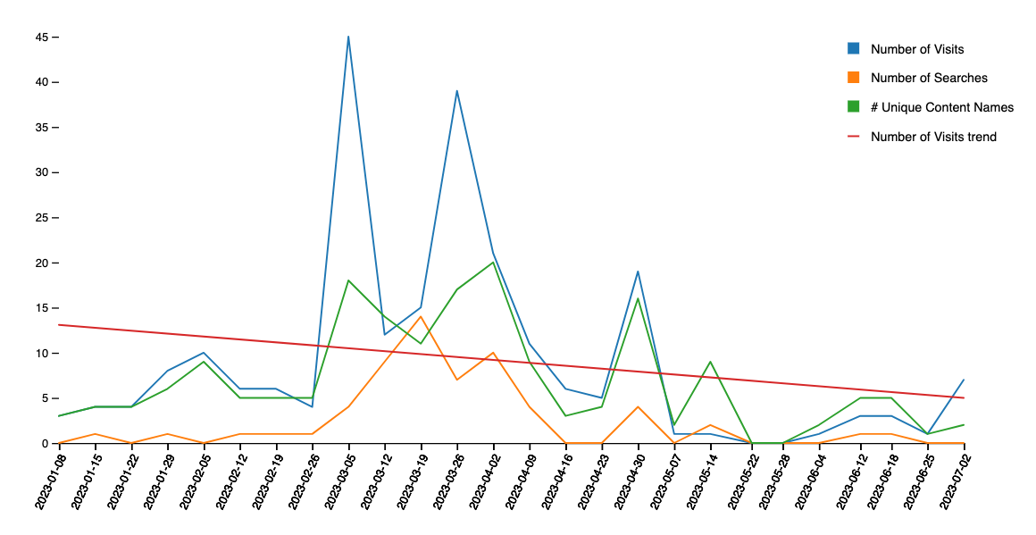
Which results in something like the attached.