How to create a graph with a second y-axis?

I have a second set of data with a vastly different range but the same domain as another data set. I'd like to graph them on the same graph, but alas, one of them gets smushed down to look virtually zero.

Can I have a second y-axis with different values?

1 Like

Hey @mathfour !

This is totally possible - Retool has a bit of documentation on it here: Charting data

We are also working on a tutorial on how to fully utilize the charting component and plotlyjs functionality in your Retool environment. Should be up hopefully at the end of next week :slight_smile:

Is there anything else with the charting component that you were trying to accomplish? Will add it to the tutorial.

1 Like

Thanks Joey for stepping in here! That's a great piece of documentation. mathfour please also feel free to reach out again if you have any other questions!

Hello folks.

I just faced the same issue but failed to resolve it by adding yaxis2.

Attached my minimum setting layout JSON

{
  "title": {
    "text": "Near Daily Transaction Count"
  },
  "xaxis": {
    "title": {
      "text": ""
    },
    "type": "date"
  },
  "yaxis": {
    "title": {
      "text": "Daily"
    },
    "side": "left",
    "type": "linear"
  },
  "yaxis2": {
    "title": {
      "text": "Cumulative"
    },
    "overlaying": "y",
    "side": "right",
    "type": "linear"
  }
}

I don't think the documentation here is complete (either in this forum or in the Retool official docs).

  • You need to modify the chart data to use Plotly JSON
  • You need to add a new key "yaxis": "y2"

I'm also experiencing a problem where the bar charts now overlap. When I make the changes above I am able to see two y-axis but the bar charts overlap. Even if I add the "barmode": "group" to configuration, the bars are stacked. Perhaps someone from Retool can comment?

Default not using Plotly JSON

After modifying to use Plotly JSON

2 Likes

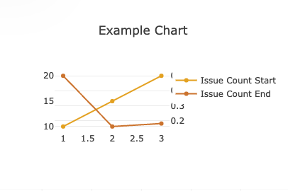
Here's some example code for a very simple chart that demonstrates the issue. Perhaps I'm leaving something out in the configuration?

Plotly Data

[
  {
    "name": "Issue Count Start",
    "x": [1,2,3],
    "y": [10, 15,20],
    "type": "bar",
    "hovertemplate": "<b>%{x}</b><br>%{fullData.name}: %{y}<extra></extra>",
    "marker": {
      "color": "#E9AB11"
    }
  },
  {
    "name": "Issue Count End",
    "barmode": "group",
    "x": [1,2,3],
    "y": [0.50,0.16,0.18],
    "yaxis": "y2",
    "type": "bar",
    "hovertemplate": "<b>%{x}</b><br>%{fullData.name}: %{y}<extra></extra>",
    "marker": {
      "color": "#D47E2F"
    }
  }
]

Plotly Layout

{
  "title": {
    "text": "Example Chart"
  },
  "xaxis": {
    "type": "-",
    "tickformat": "",
    "gridcolor": "#fff",
    "zerolinecolor": "#fff"
  },
  "yaxis": {
    "title": {
      "text": "",
      "standoff": 6,
      "font": {
        "size": 12
      }
    },
    "type": "linear",
    "tickformat": "",
    "zerolinecolor": "#DEDEDE"
  },
  "yaxis2": {
    "title": {
      "text": "",
      "standoff": 6,
      "font": {
        "size": 12
      }
    },
    "side": "right",
    "overlaying": "y",
    "type": "linear",
    "tickformat": "",
    "zerolinecolor": "#DEDEDE"
  }
}

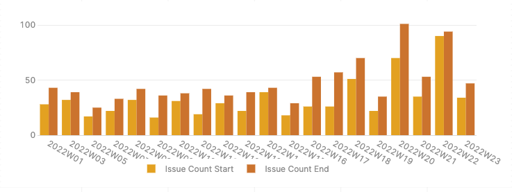
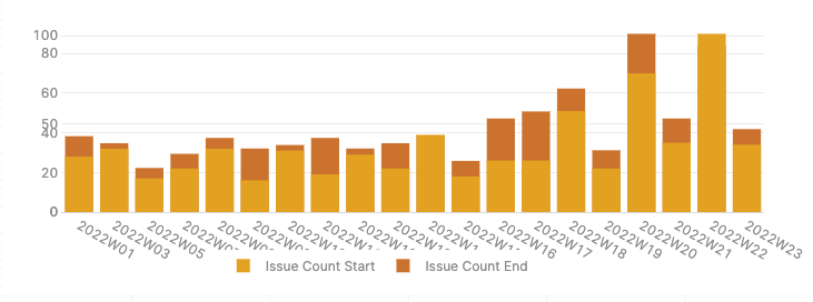
Do note that if I change the type from bar to scatter this seems to work? A pity that it doesn't work with bar charts though...

image

1 Like