I just noticed if you use the "Preview" button, the tab order will be messed up just like you described. However, if you use the "Live Preview" button right next to it, the tab order is correct
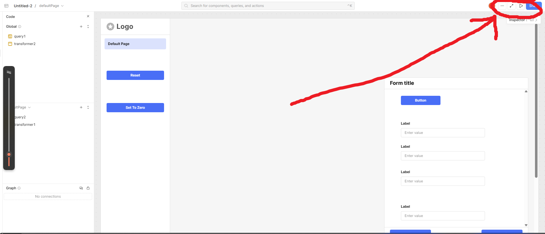
Button Order (Left -> Right): me (Orange circle with a whtie S) ... Preview Mode (two arrows pointing towards opposite corners) Live Preview (play button/triangle) Share Button (big blue button)
the javascript above worked once for me, but I haven't seen it work again so I might have used the Live Preview instead of Preview Mode and not noticed which made me think the code did something. I'ma leave the post up just incase it does work for somebody, but if it doesn't work as I hopped for others I'll remove it so as to not confuse future readers.
I personally just tested this out in live preview vs preview, and noticed that the tab order in the form behaved normally in the live preview (left to right and then down), but wrong in the preview. The live preview is what end users see though, so it should be fine regardless of how the form is laid out or what order you add fields. The other preview is just an editing preview to test things out without queries rerunning (although it is odd that it affects tab ordering).
Mike:
I have added a Birth Date field and now there are no blank spaces and the tab order is now working properly in my Patient Screen.
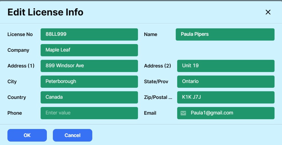
I am including a screen from another application (License) which has a blank. It tabs properly until it gets to the blank space, then it tabs down wards to the bottom left field, then it tabs up to the right column and tabs down the right column.
People have been talking about getting to a "Preview" Screen but I have no reference to a "Preview " screen on my computer.
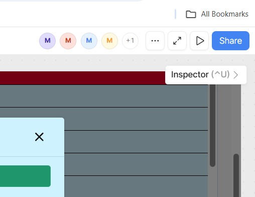
Here is preview mode (with the arrows):
The play button to the right of it is live preview or its also called "user mode" since it's what users see/experience. From here on I'll refer to it as user mode. I don't recommend using the "preview mode" to test user experience, it's more for quick testing of functionality and to see what the page looks like without panels in the way.
I see what you mean about tabbing down and then back up to the right. If you're testing this out in the app editor and the tab order is incorrect, try testing it in user mode, and it should be fine.
The play button / triangle button is the mode in which the tab order should be correct. If it isn't, something worth trying before moving on is to add an input field in that empty spot and then see if it fixes the order, then remove it again and hopefully it retains the correct order.
Otherwise, there is an existing feature request for being able to set the tab order. Some engineers have had a hard time reproducing the issue you're having, however. If the problem remains for you, and you're comfortable with it, you can direct message me your app export and we can further investigate this.
I use the triangle button and it has made no difference.
I have found 2 things that help.
Set up your input fields so there are no spaces. i.e. if your fields are 2 across, have all rows 2 across.
If you are building for the first time it usually works fine with missing fields. Its when you you need to add a new field with a space to the right that it starts to act up. So if I need to do this, I rebuild the screen from scratch and then it works fine.
As per the screen below, the options for the width of the Page Panel are small, medium and large. If I select small, I still have an appearance of the page panel and this shows in both development and application mode.
Is there some way of getting rid of the page panel for the customer using the program?
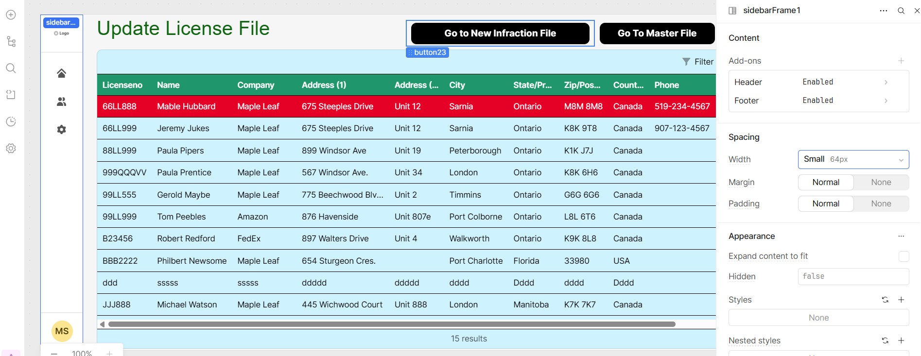
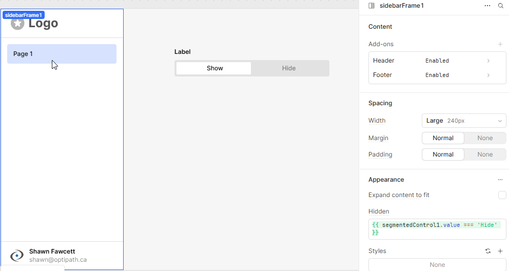
The other way to hide the Page Panel is to set Hidden in the Page Panel to true. You can also add JavaScript here to dynamically hide the panel. In the screenshot below, I added a segmentedControl component to show and hide the Page Panel with this: {{ segmentedControl1.value === 'Hide' }}.
Stranger things have happened! I'm glad you got it to the way you need.
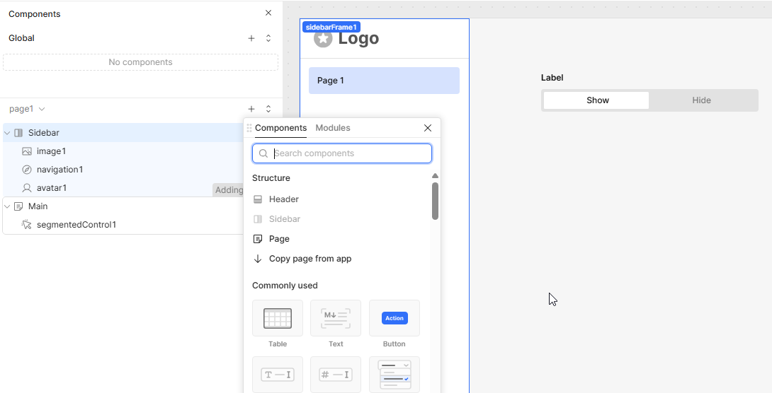
If you ever want to add it again, you just click on the + beside you page to add a component and you will see it there. Just click on it and it will add it for you.
I think he wanted it hidden for everybody except him.... maybe not? but if so, I'd probly set Hidden on sidebarFrame1 as {{ current_user.groups.find(group => group.name === "admin")? false : true }} instead so you don't have to manually unhide it
I always feel bad giving you workarounds because I think that makes up like 99% of my "solutions" I've presented to you (I'm sure its even worse since they're mostly bug workarounds, instead of workarounds for a missing feature or component)... but especially since I know you aren't a big fan of them in general (if I remember right you're a SQL/DB Engineer person? so ya, I'd get annoyed having someone toss ridiculously weird looking code at me all time ).
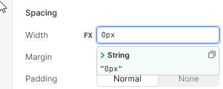
ya I 100% agree, the {{ }} needs an update so that it allows multi-line input. the biggest issue with putting javascript in those is having to design absolutely ridiculous one-liners you'd normally never see in production code due to their difficulty in reading and maintaining.... I really hate to do this, but by now you know me.... there is an in-place workaround for this (other than making a Function instead of a Query)
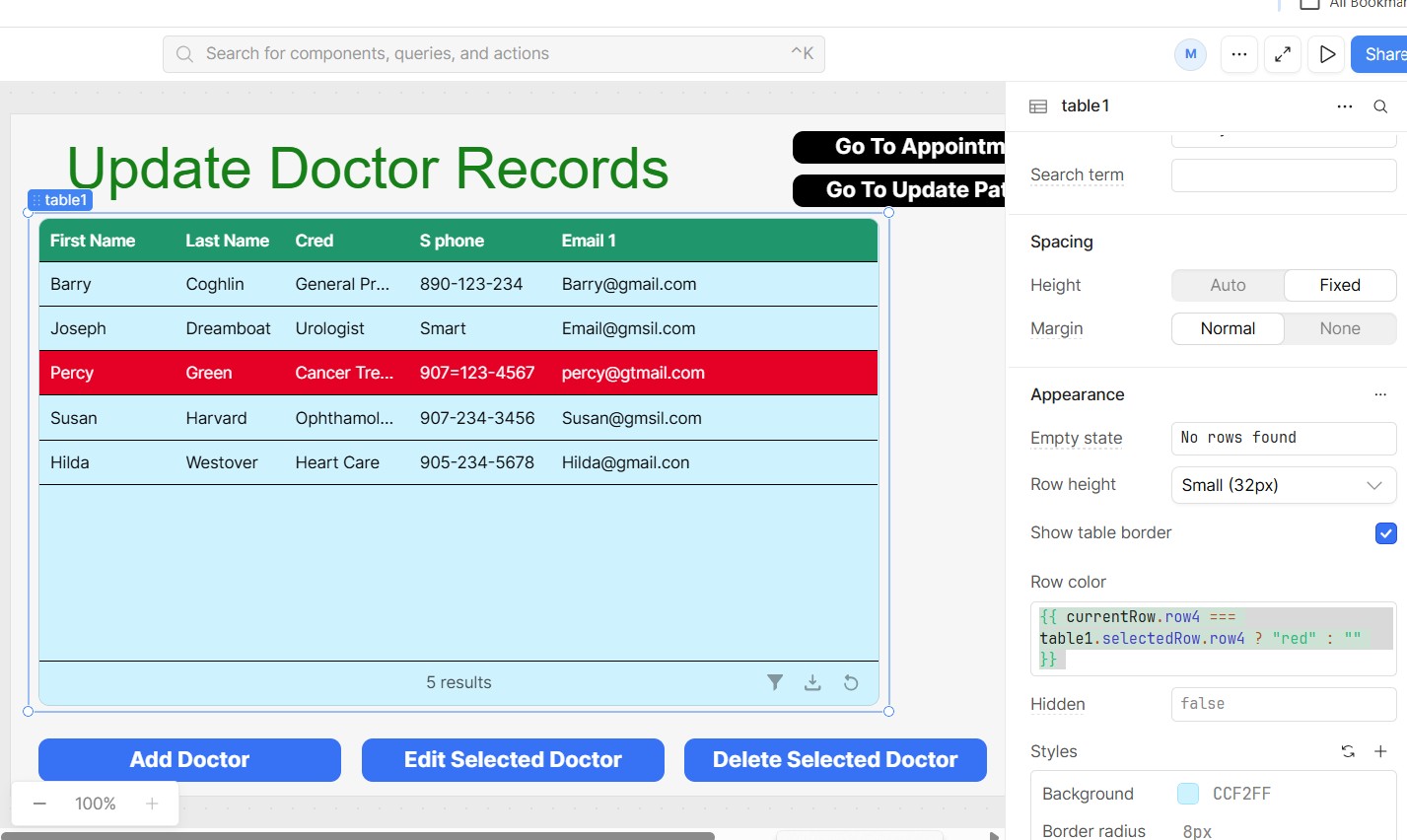
(function() {
  // Code to be executed immediately
  if(currentRow.row4 === table1.selectedRow.row4){
    return "red";
  }
  else {
    return ""
  }
})();
now you can write your code in notepad or whatever and you can code how you normally would with temporary variables and whatever, just don't expect to be able to read it in retool after it applies line wrapping in a very narrow text box.
"Give a coder an inch, and he'll use it to recreate what he feels is missing."
- Some angry boss, probably