Hello ,
I want to display the legend names on the hover of my stacked bar chart, after the squared colour and before the value.
How can I do it ?
Thanks in advance guys
Hello ,
I want to display the legend names on the hover of my stacked bar chart, after the squared colour and before the value.
How can I do it ?
Thanks in advance guys
As we connected in office hours, I'm taking a look at this. Can you share what you have for the "hovertemplate" in the Plotly JSON tab of the chart content data?

Hello I did not have any hovertemplate, can you give me a template?
Hmm I'm trying to reproduce your set up so that I can work on a template/solution. Can you share the full configuration for the data & layout?
data:
[
  {
    "name": "Nombre de mandats signés",
    "x": {{graph_mandats.data.mandate_signed_at}},
    "y": {{graph_mandats.data.mandate_id}},
        "texttemplate": "%{y}",
    "textposition": "auto",
    "type": "bar",
    "transforms": [
      {
        "type": "groupby",
        "groups": {{graph_mandats.data.mandat_type}},

      },
      {
        "type": "sort",
        "target": {{graph_mandats.data.mandate_signed_at}},
        "order": "ascending"
      },
      {
        "type": "aggregate",
        "groups": {{graph_mandats.data.mandate_signed_at}},
        "aggregations": [
          {
            "target": "y",
            "func": "count",
            "enabled": true
          }
        ]
      }
    ]
  }
]
layout:
{"barmode":"stack",
  "title": {
    "text": "",
    "font": {
      "color": "#3D3D3D",
      "size": 16
    }
  },
  "font": {
    "family": "var(--default-font, var(--sans-serif))",
    "color": "#979797"
  },
  "showlegend": true,
  "legend": {
    "xanchor": "center",
    "x": 0.45,
    "y": -0.2,
    "orientation": "h"
  },
  "margin": {
    "l": 16,
    "r": 24,
    "t": 24,
    "b": 32,
    "pad": 2
  },
  "hovermode": "x unified",
  "hovertemplate": '%{text}<br>Valeur: %{y}<extra></extra>' ,
  "hoverlabel": {
    "bgcolor": "#000",
    "bordercolor": "#000",
    "font": {
      "color": "#fff",
      "family": "var(--default-font, var(--sans-serif))",
      "size": 12
    }
  },
  "clickmode": "select+event",
  "dragmode": "select",
  "xaxis": {
    "title": {
      "text": "",
      "standoff": 6,
      "font": {
        "size": 12
      }
    },
    "type": "-",
    "tickformat": "",
    "automargin": true,
    "fixedrange": true,
    "gridcolor": "#fff",
    "zerolinecolor": "#fff"
  },
  "yaxis": {
    "title": {
      "text": "",
      "standoff": 6,
      "font": {
        "size": 12
      }
    },
    "type": "linear",
    "tickformat": "",
    "automargin": true,
    "fixedrange": true,
    "zerolinecolor": "#DEDEDE"
  },
"scene" : {
    "hovermode": "x unified",
  "hovertemplate": '%{text}<br>Valeur: %{y}<extra></extra>' ,


}
}
Can you try adding
"hovertemplate": '%{fullData.transforms[0].groups}<extra></extra>',
to the chart's Data?
Like this:

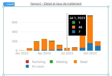
That's perfect. Thank you.
Wonderful!
I haven't found a good solution for the issue where it only selects the bottom section of a stacked bar group ![]() I'm wondering if it's maybe a Plotly feature request similar to this request
I'm wondering if it's maybe a Plotly feature request similar to this request