Hey there @dlbhilbig! Thanks for attending Office Hours on Tuesday 
This question has come up before and seems like it might be a good chance to explore how to use React custom components in Retool! This isn't meant to be a complete example but hopefully, it can give some idea of what can be done. A JSON export is included at the bottom to play around with!
We can use the boilerplate that's provided when creating a new custom component. That has a lot of what's needed to get everything connected, and we can just switch out the CSS in the <style> tag and the JSX in the MyCustomComponent function to suit the needs for the grid!
The JSX can be taken largely from the stackoverflow example you linked, just with a couple modifications for Retool.
React lets you dynamically define HTML components to be part of the element you're creating by passing JSX expressions within {}. Here, there's a div that represents the grid, and then all the nodes within it are generated dynamically within {}:
<div id="grid" />
  {/* map function that returns more divs /*}
</div>
That's done by mapping over the nested arrays in the dataset, which we'll pass to the model of the custom component so something like:
model.gridData.map((row, y) => (
   <div>
      {/* a nested map function for each node */}
   </div>
)
The nodes themselves is where you can add the click handler by passing a function to the onClick property of the element you create. In this case we can use the modelUpdate function which lets us pass data back to the app model which we can reference in the rest of the Retool app. So the onClick handler will look something like this:
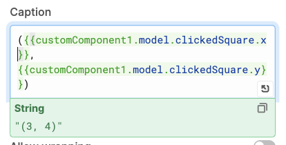
() => modelUpdate({ clickedSquare: { x, y }})
Note we're passing a clickedSquare property back that has the clicked coordinates. This can be referenced elsewhere in the Retool app using {{ customComponent.model.clickedSquare }}
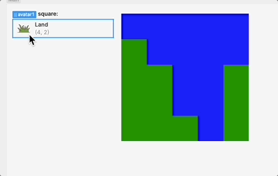
We can also pass it a type property to reference with CSS so that it can be colored correctly, since we're mapping over the data being passed in that might be something like
type={node[0]}
All together it looks like this:
const MyCustomComponent = ({ model, modelUpdate }) => (
    <div id="grid">
      {model.gridData.map((row, y) => (
        <div key={y} className="row">
          {row.map((node, x) => (
            <div
              key={x}
              className="map_square"
              type={node[0]}
              onClick={() =>
                modelUpdate({
                  clickedSquare: { x, y }
                })
              }
            />
          ))}
        </div>
      ))}
    </div>
  );
We can then add in the CSS that colors each square based on its type:
  #grid{
    display: flex;
    flex-direction: column;
  }

  .row{
    display: flex;
  }

  .map_square{
    height: min(18vh, 18vw);
    width: min(18vh, 18vw);
  }

  .map_square[type="0"]{
    background-color: green;
  }

  .map_square[type="1"]{
    background-color: blue;
  }
Again, this is only the start. It's possible to conditionally create img elements instead of div and pass in source urls from the component data, and much more!
Let me know if that's helpful or if you have any questions!
clickable_grid.json
 How are you imprinting this new data? Where is the new data coming from? Are you changing the underlying query?
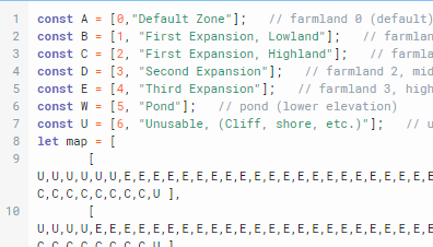