How can I create a container with a title, but that is collapsible into the header?
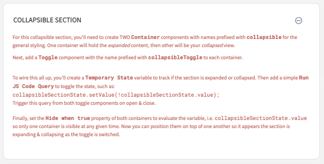
Here are my instructions (from the picture) for adding this to an app:
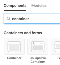
For this collapsible section, you'll need to create TWO Container components with names prefixed with collapsible for the general styling. One container will hold the expanded content, then other will be your collapsed view.
Next, add a Toggle component with the name prefixed with collapsibleToggle to each container.
To wire this all up, you'll create a Temporary State variable to track if the section is expanded or collapsed. Then add a simple Run JS Code Query to toggle the state, such as:
collapsibleSectionState.setValue(!collapsibleSectionState.value);Trigger this query from both toggle components on open & close.
Finally, set the Hide when true property of both containers to evaluate the variable, i.e.
collapsibleSectionState.valueso only one container is visible at any given time. Now you can position them on top of one another so it appears the section is expanding & collapsing as the toggle is switched.
Finally, here is the CSS I applied to make the styling "look like" an expanding section (notice I'm overriding all of the "toggle switch" look and replacing with a FontAwesome icon):
/* BEGIN Collapsible Sections */
.retool-widget[class*=" _retool-container-collapsible"] {
  transition: none !important;
}
.retool-widget[class*=" _retool-container-collapsible"]>.retool-container {
  border: 1px solid #D9E0E7 !important;
  border-radius: 0.7rem;
}
.retool-widget[class*=" _retool-container-collapsibleToggle"] .input-control-component__label {
  color: #252525;
  font-size: 1rem;
  font-weight: bold;
  text-transform: uppercase;
  line-height: 2rem;
  margin-left: -1rem;
}
.retool-widget[class*=" _retool-container-collapsibleToggle"] .input-control-component__input>button {
  background-color: inherit;
  float: right;
}
.retool-widget[class*=" _retool-container-collapsibleToggle"] .input-control-component__input>button:after {
  content: "\f055";
  font-family: "Font Awesome 5 Pro";
  vertical-align: middle;
  font-size: 1rem;
  color: #8492A6;
  position: relative;
  top: inherit;
  left: inherit;
  width: inherit;
  height: inherit;
  background-color: inherit;
  border-radius: inherit;;
  box-shadow: inherit;
  transition: inherit;
}
.retool-widget[class*=" _retool-container-collapsibleToggle"] .input-control-component__input>button.ant-switch-checked:after {
  content: "\f056";
}
/* END Collapsible Sections */
8 Likes
Hey I just want to say a quick thanks for sharing this. It’s people like you that make forums great. You are saving multiple people hours of time… can’t say thanks enough.
4 Likes
It would be great if this was supported by containers/tabbed containers natively @justin!
We want to do the same thing for a filter section, and other areas - those that occupy a lot of space but are not relevant when actually consuming/using the app.
Thanks,
Jack
2 Likes
I would like to add my +1 to this, an out of the box collapsible container would be quite helpful for us to allow detailed information that doesn’t need to be seen immediately to be reveal when necessary
2 Likes
Would also like to jump on this and say it's pretty ridiculous to not support this natively
It is supported now
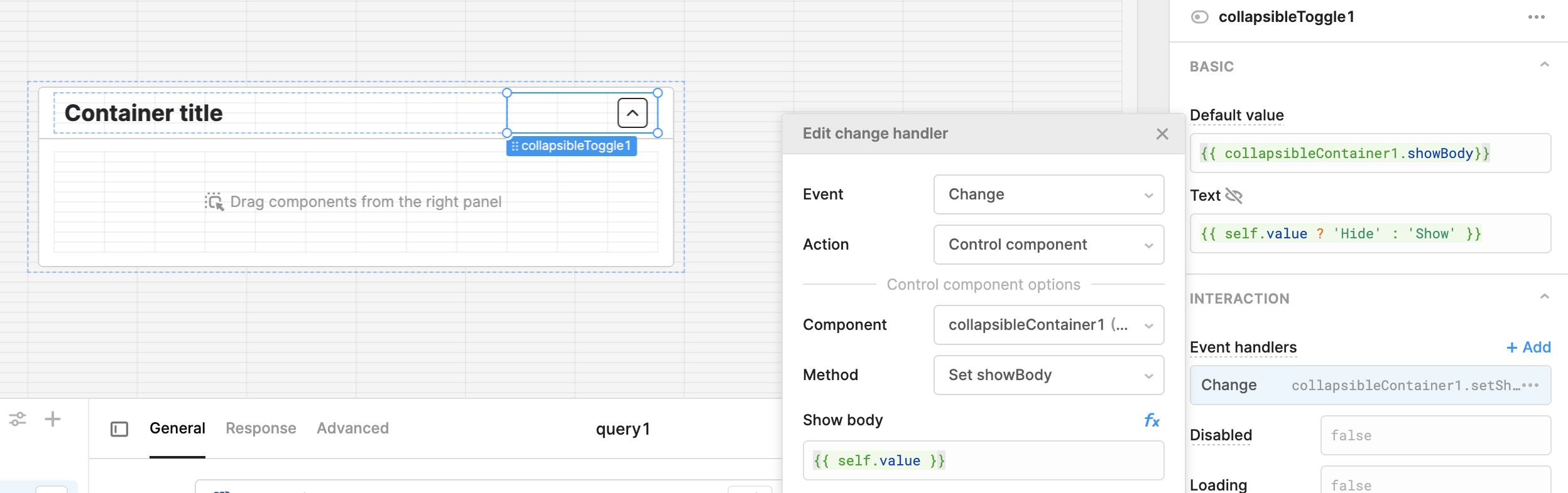
Hi @ScottR , do you know how to have a collapsible container closed by default ? i don't find anything on it on the forum 
Thanks by advance 
Oscar
You can reverse the values in a few fields and then set the event to show when clicked on the toggle....
Thanks a lot !
Hi @ScottR, when you say "reverse the values in a few fields", which fields are you referring to? It looks like your screenshot includes the default component values for all the fields. Thanks!
if the container has a value it is true and it will 'Hide' that is what I meant by reverse in the Text field.... try implementing the way it is in the screenshot