Hello, i have created a chart from a table directly imported through Stripe API.
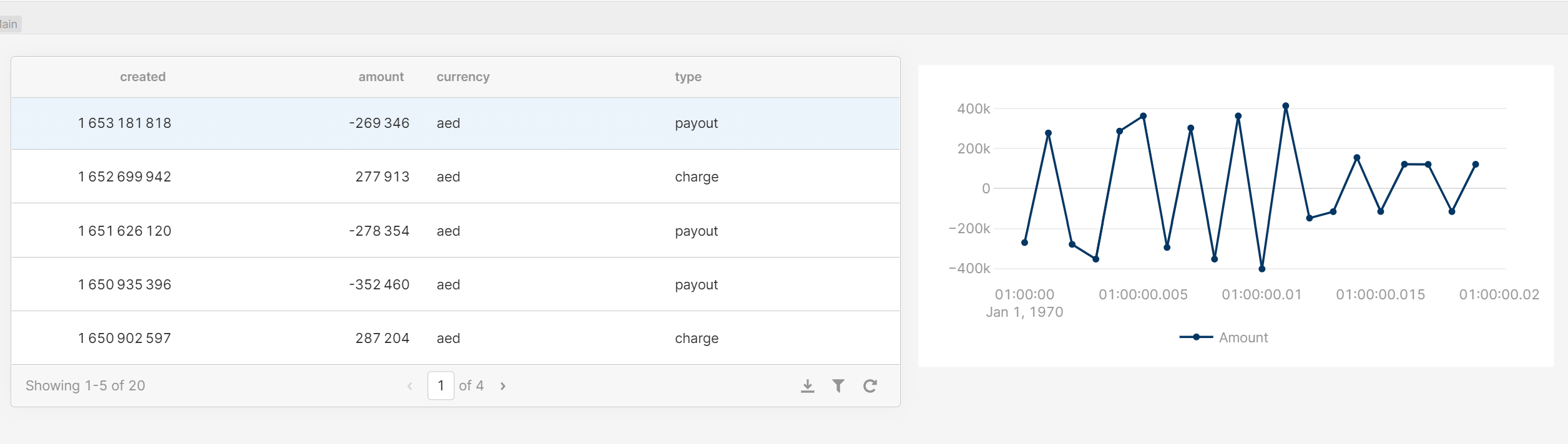
I would like to import on this chart only postive amount. Do you know a solution for example using the "type" column ? (Because when type=charge the amount is >0)
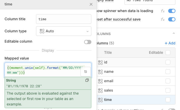
My date on column "created" is using unix number. I have tried to put this code the X tick format but dosn't work also ..
"{{moment.unix('{{table1.selectedRow.data.created}}').format("MM/DD/YYYY HH:mm")}}"
Do you know how i can fix it ?
And last question any of you have created a chart without creating a table from stripe ?
Right now it's little bit tedious i m creating all API, then creating a table from this API and creating a chart from the table.
Thanks for you help,
Cheers