This ruins the design as I cannot control the zoom of the user. The difference between the two which causes this issue is that the segmented control on the left only has an icon displayed, instead of text.
For some reason, I was not able to reproduce the behavior on Chrome or Safari Maybe it has something to do with the data
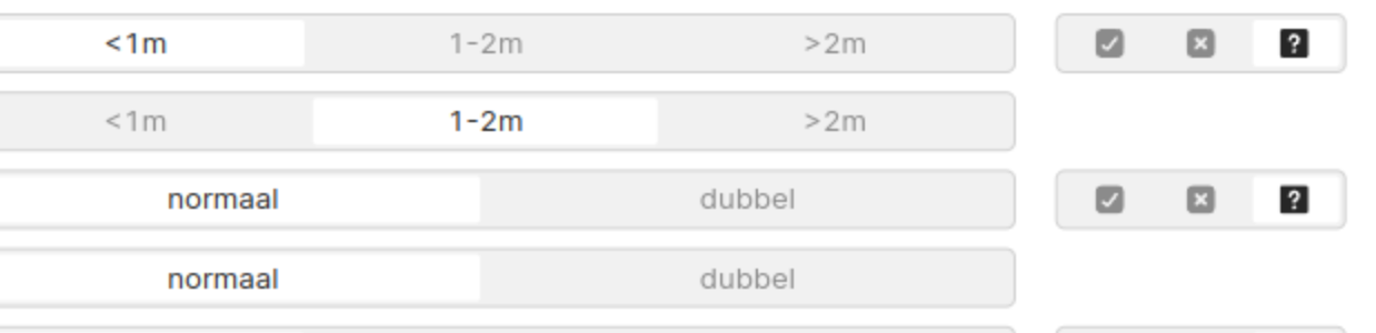
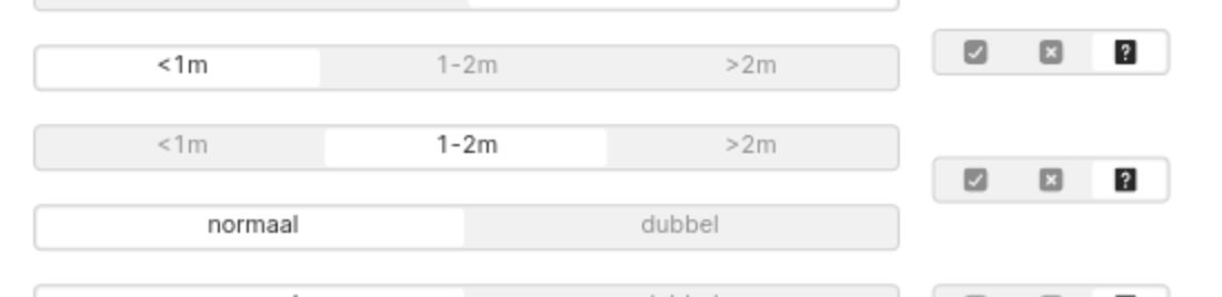
One thought I had is that it might be worth checking to see if this same issue happens in a listView. We support nested listViews, so you could have a listView for the main segmentedControls and then two listViews at the bottom for the other components. Currently, it adds a lot of extra padding, as you can see below, but we are going to be shipping a way to remove that extra padding very soon
Since I wasn't able to reproduce the issue in your export, I'm not 100% sure if the listView will solve. I tried my best to create a listView with your data so that you can try it out before refactoring your actual app (attached). It's definitely not the exact same, but I think it's fairly close. If you find that this works, you could remove the borders around the listViews to be closer to your original app
This is all just an idea for a workaround -- we still have a feature request on file internally to add alignment to containers