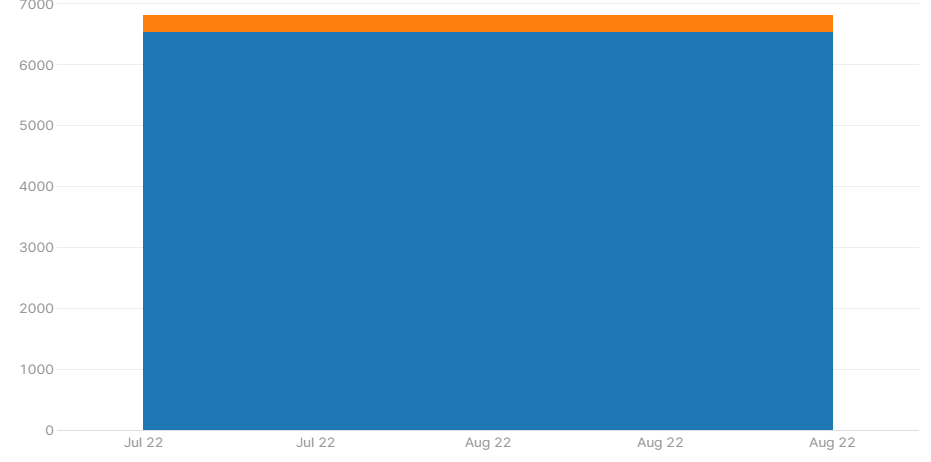
I keep running into a problem with bar charts displaying repeated values on the x-axis, like this:
The data being queried only has one month, August 2022, so I expect the bar chart to only be showing August 2022, and only showing it once. However, it shows August 2022 three times and July 2022 twice as well.
I'm still learning Retool and this may be a completely rookie mistake, but I've been stuck on it for a while now and can't find any other posts about this issue. I'd appreciate any help sorting out what's happening here. Thanks!
welcome to the forum
I'm guessing there's something in the data that Plotly is thinking is multiple dates, you may need to share the data that you're trying to show so we can better understand what's happening.
Thank you, @dcartlidge! Happy to be here  And sorry for the delay!
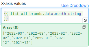
I found the issue, when I query the Postgres database, it returns an array with all dates from the table, and multiple rows have the same date. So the array that's being returned looks like this:
I'm sure this is a very beginner question, but I've tried everything I can think of and can't pull out only the unique values from that array. Do you have any suggestions?
Thanks again and Happy Holidays!
ahh I see, are there other fields in the list_all_brands.data object that you could use to identify the different data sets? Maybe if you can share the structure of the whole data object not just the month_string property it might help
I finally figured it out! Instead of {{ list_all_brands.data.month_string }}, I just needed to set the x-axis to {{ _.uniq(list_all_brands.data.month_string) }}.
Can't believe the hours of headache caused by such a simple problem, but I'm so excited to have it working now!