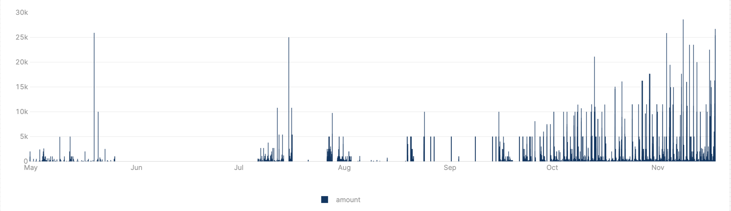
So I am displaying some data on a chart. It's a pretty basic bar graph showing values (y axis) over time (x axis). My use case requires me to group the x axis by some lower granularity time frame though - say weeks or months.
Right now the chart seems to just group the x axis by day by default and it makes the chart harder to read and for my use case i care less about the daily values and more about the weekly/monthly values. The current chart looks like this:
So i'm wondering if there is an easy way to aggregate/group the axis by other time frames? I've ran into a few people saying you have to use custom js or update your table to have a new column with the datetime grouped there but i'd rather not do either of those things as this seems like a relatively basic use case (although perhaps this is not what retool is geared towards doing?).
If it helps - my datetime column called CreatedAt is actually in unix time in the db and I have set the X-axis type to "Date" under the layout options of the chart in retool.
I thought about just editing the layout js directly but plotly apparently doesn't support grouping the x axis if it is datetime by week or month per this SO thread (although this is from 2018 so maybe things have changed?): javascript - How to group values by week in plotly.js - Stack Overflow