The video is self-explanatory. The app structure will fail when trying to reposition components or the bounding box of the app itself within the grid. Results in "Lost’ or “Ghost” Components.
Not sure what a good fix on this is maybe a setting for fixed and relative positioning to a parent item. I think the layout editor needs some fine-tuning over the next year or two to make it easier to use and more functional
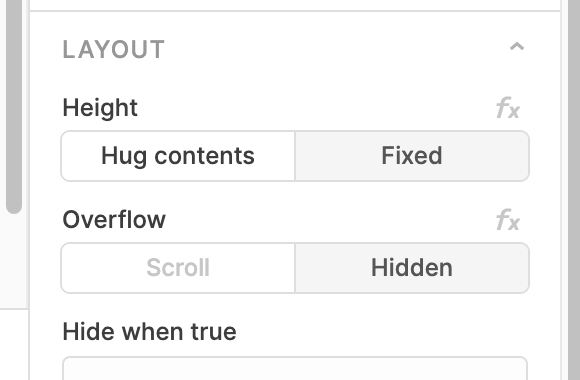
I appreciate the thorough walkthrough in that video! We've been thinking about resizing containers and how that should affect child components a good amount recently- in the last couple weeks we added in these Layout options to tabbed containers, containers, and forms.
If you enable Hug contents, it disables the ability to resize the height of a container and bases it solely off of the height of the non-hidden child components
If the container was set to Scroll and a fixed height, a scrollbar would show to scroll down to where those components get lost beyond the bottom border of the container. They maintain their current position in the grid as the height changes which does present some interesting questions about UX in the situation here. Should it relocate the components higher up if the bottom of the container moves up and there is open space above?
I think it’s a really good question tbh. At the end of the day, it’s all about increasing usability and intuitiveness right? Answering your last question I would say most likely, having the components dynamic map their positions to the “Top Down” of the app does help with the flow but what happens when you want to do layout/design then connect the components of the app?
The hug/overflow features are a great addition to the layout experience, ultra long term I would wager the best approach may be to have an experience similar to that of Webflow where the controllers on the right just feed style rules to each component and the parent-child relationship is really easy to navigate and edit. Short term, more features that reduce frustration would be the way to go imo; huggability, scroll rules, top-down position, then maybe custom sizing, fixed positions, grid density controls, blah blah stuff like that.
Maybe it’s a product education problem and these are all already solved! I do like the idea of having a layout editor “view” that solely allows me to control the visual aspect of the app plus it would enable more new users I would think!